
As someone coming from a long time in the computer graphics world, I tend to think in complex ways to combine colors and layers to achieve a certain effect, esp if I'm mocking a piece up in software first (which I sometimes do, esp if there are specific geometric forms I want to work with).
So here's part of the digital version of something I'm working on:

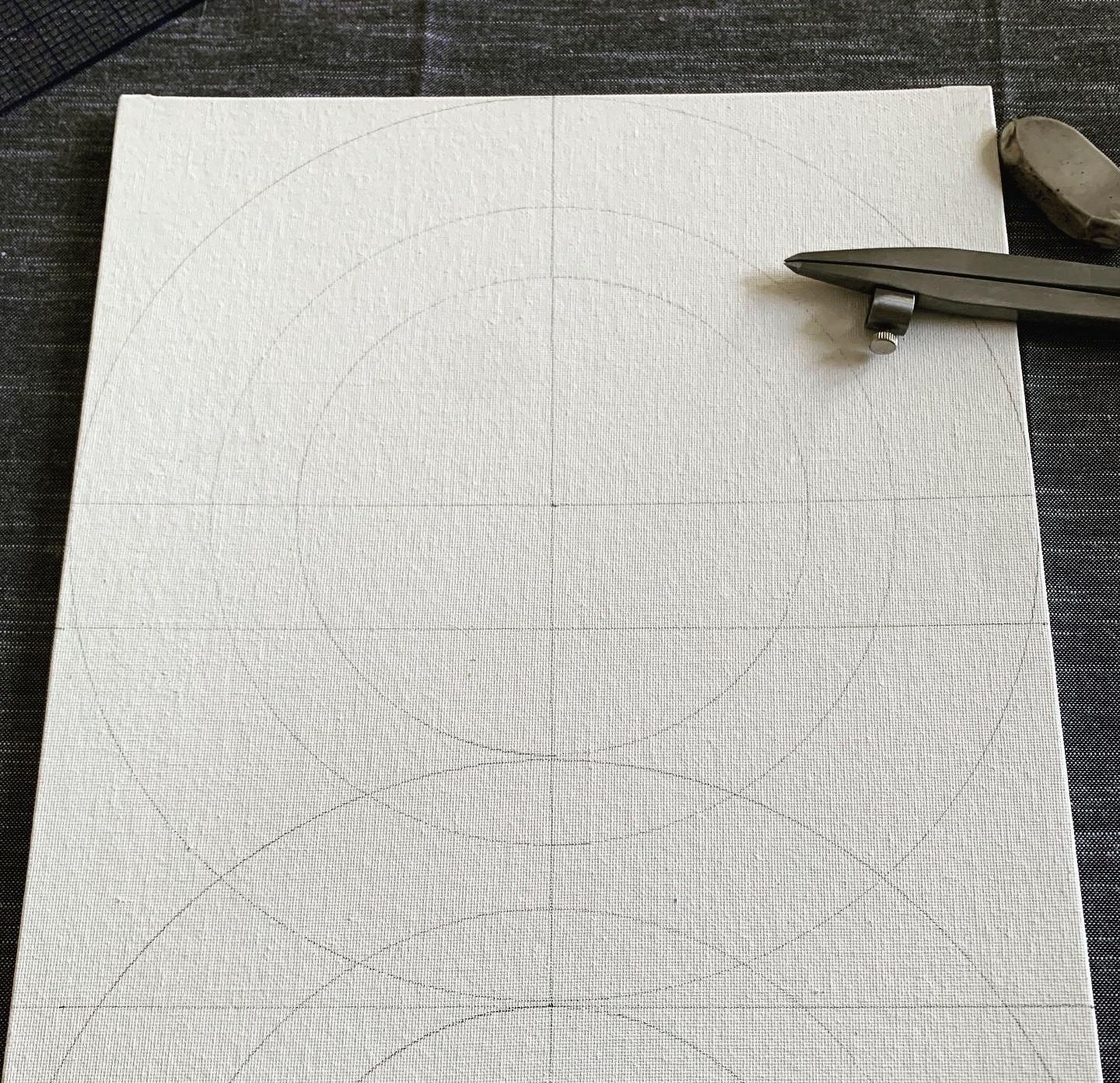
Here it's easy to conceptualize a piece and approach it almost like you would watercolor: multiple transparent overlays, each producing various combinations of colors. Having gotten an idea of what I wanted, I went at a canvas panel with my ruler and compass and layed out the procession of shapes I wanted.
Now having in hand a mockup and marked-out canvas, I proceeded to attempt a wash with the acrylic, with the idea of overlaying multiple washes to get that lovely transparent set of affects I wanted.
This was a failure.
What I got was (yes I changed the planned color in the meantime):
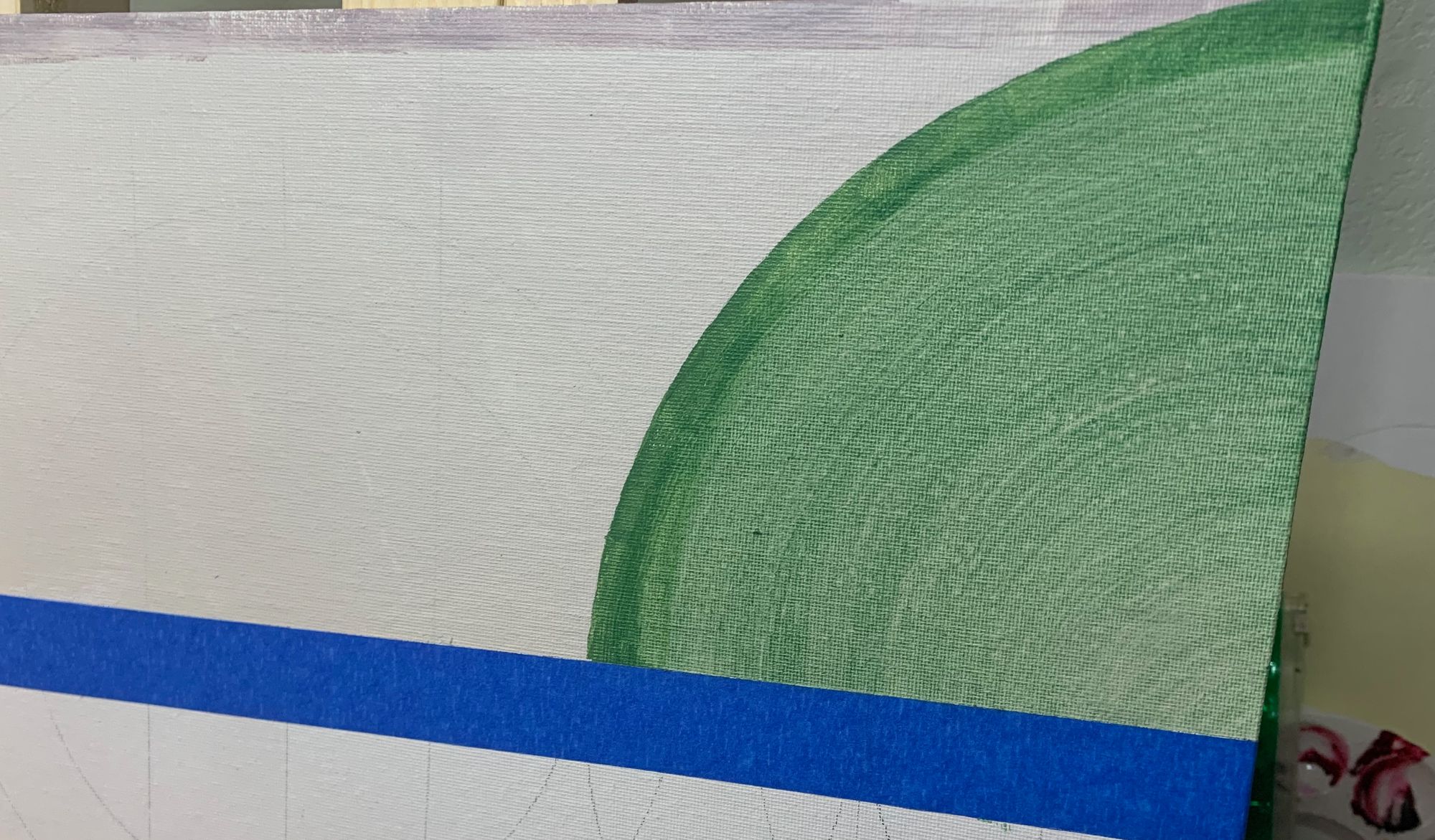
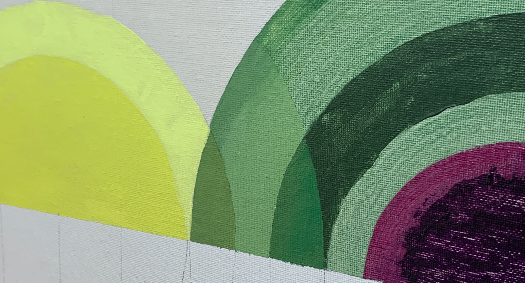
Streaky, splotchy, too saturated. Obviously I have more to learn. 🤨 So I'm scratching the "transparent wash" approach and going back to mixing relatively opaque colors I want.
Here's the next step as I start mixing for the right color, not a particular transparency. Note the opaque section where the yellows and greens "overlap".
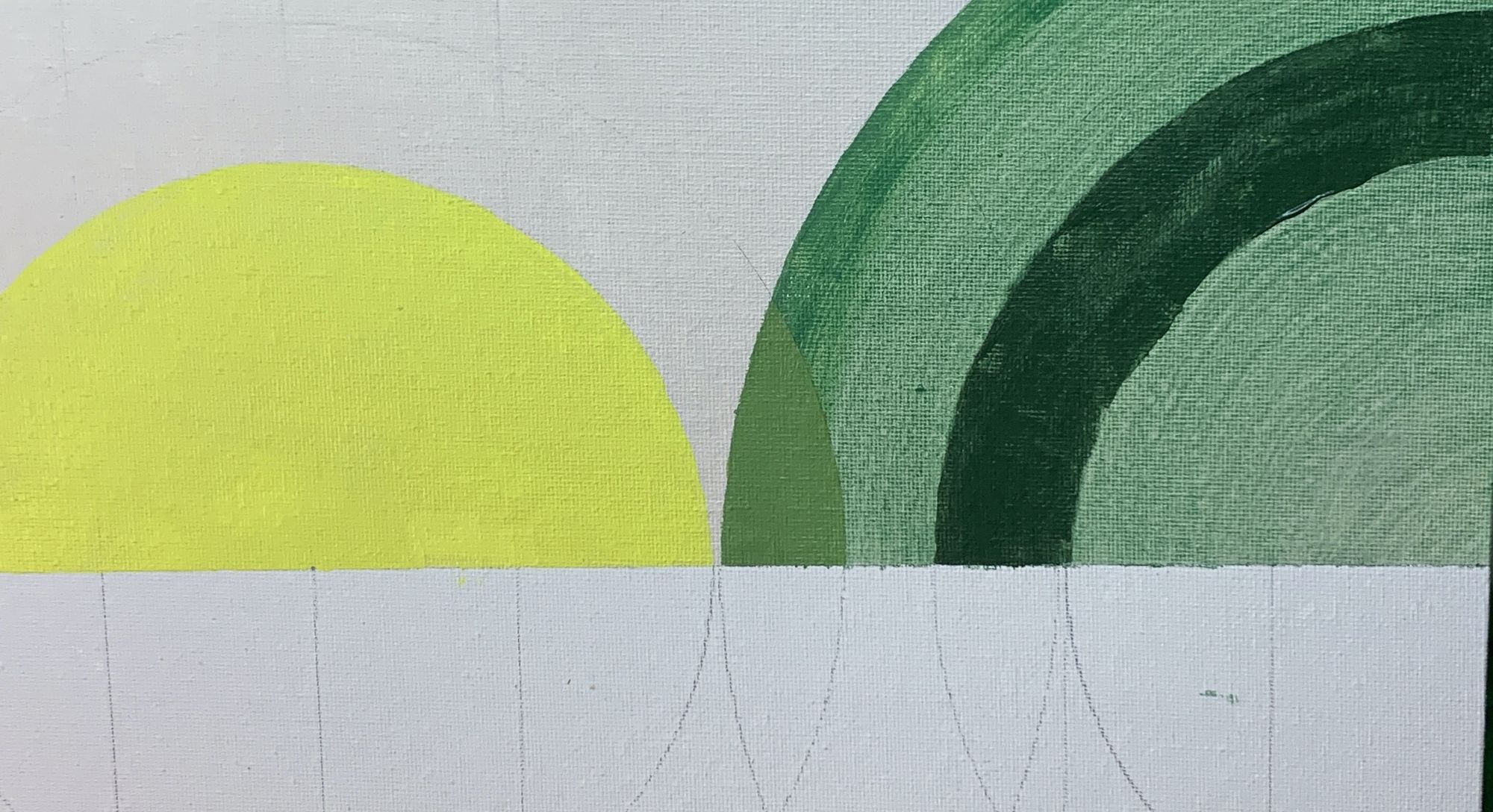
And the current status, with botched purple yet to be fixed: